Travel Readiness

Flying is already stressful. The app was making it worse. We fixed that.

Traveler holding an iphone with the new United App open

Role

Lead Product Designer & Manager

TL;DR

Unified a fragmented mobile experience built on legacy architecture. Collaborated with engineering to enable a dynamic, context-aware home screen.

Business & User Impact

Outcome

The United app had everything a traveler might need and made it nearly impossible to find when it mattered. Gate changes, flight status, upgrade windows — buried under five navigation layers and a homepage full of promotions nobody asked for. The brief was to fix usability. The real work was rethinking what the app was actually for: not a feature catalog, but a travel companion that knows where you are and what you need next.

The United app had everything a traveler might need and made it nearly impossible to find when it mattered. Gate changes, flight status, upgrade windows — buried under five navigation layers and a homepage full of promotions nobody asked for. The brief was to fix usability. The real work was rethinking what the app was actually for: not a feature catalog, but a travel companion that knows where you are and what you need next.

Business

Webby People’s Voice Award Winner, Best Travel App

15–20% reduction in support volume

New 1:N design system

User

Exceeded WCAG AA standards

#1 Top-Downloaded airline app (iOS and Android)

Reduced user anxiety and decision fatigue during travel

Users

Webby People’s Voice Award Winner, Best Travel App

15–20% reduction in support volume

New 1:N design system

Exceeded WCAG AA standards

#1 Top-Downloaded airline app (iOS and Android)

Reduced user anxiety and decision fatigue during travel

Opportunity & Approach

Strategy

Opportunity

Poor app usability. Low accessibility scores. Legacy architecture. Looming DOT deadlines. Most teams would have called that a crisis. We called it a clean reason to rebuild the thing right.

Poor app usability. Low accessibility scores. Legacy architecture. Looming DOT deadlines. Most teams would have called that a crisis. We called it a clean reason to rebuild the thing right.

Version of the United Airlines app before updates

Approach

We centered everything around situational awareness: what does this person need right now, based on where they are in their trip? That framing did two things at once. It turned a compliance mandate (WCAG AA) into a reason to build better, not just build compliant. And it gave us a principled reason to cut: if a feature didn't serve a real travel moment, it didn't belong on the screen.

We centered everything around situational awareness: what does this person need right now, based on where they are in their trip? That framing did two things at once. It turned a compliance mandate (WCAG AA) into a reason to build better, not just build compliant. And it gave us a principled reason to cut: if a feature didn't serve a real travel moment, it didn't belong on the screen.

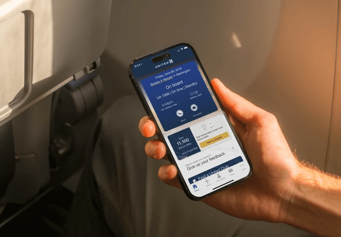
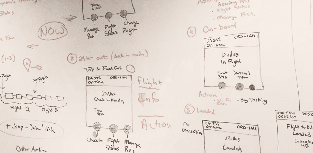
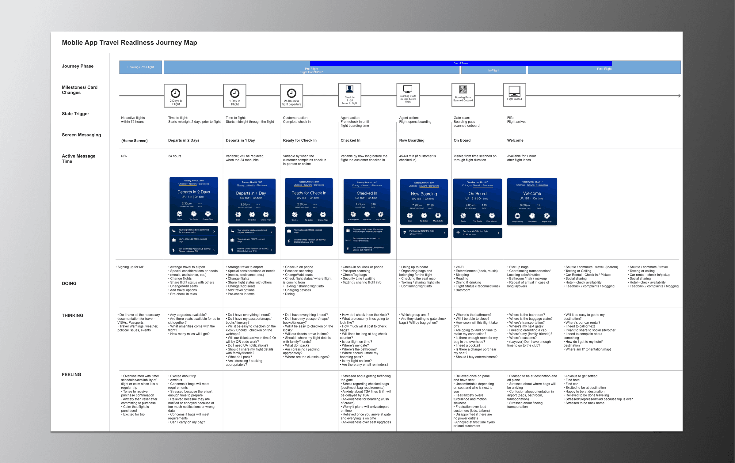
To pivot to situational awareness, we needed to:

Remove promotional clutter

Remove promotional clutter

Reduce multi-directional scrolling

Reduce multi-directional scrolling

Rearchitect navigation to fewer, clearer paths

Rearchitect navigation to fewer, clearer paths

User research, workshops, and principles

Findings & Risks

Before we designed anything, we went to the airport. Literally. Follow-alongs with real travelers showed us what the app actually felt like under pressure — not in a usability lab, not in a stakeholder meeting. I ran moment-mapping workshops to translate what we saw into something the team could build from. The findings didn't just define our principles. They gave us the receipts to secure executive funding and move fast.

Before we designed anything, we went to the airport. Literally. Follow-alongs with real travelers showed us what the app actually felt like under pressure — not in a usability lab, not in a stakeholder meeting. I ran moment-mapping workshops to translate what we saw into something the team could build from. The findings didn't just define our principles. They gave us the receipts to secure executive funding and move fast.

Key Findings

Home screen image of the united app at different stages of a flight

Key moments mattered

40% of features clustered around the same travel moment. 25% rarely got used at all. 15% were technically infeasible. We were missing focus, not features.

Key moments mattered

40% of features clustered around the same travel moment. 25% rarely got used at all. 15% were technically infeasible. We were missing focus, not features.

Most navigation went unused

Users stayed on the home page because the alternative was five layers deep. Frustrated isn't the right word. Defeated is closer.

Most navigation went unused

Users stayed on the home page because the alternative was five layers deep. Frustrated isn't the right word. Defeated is closer.

Addressing Risks

Every risk had a designed response. That was the point.

Too many internal data sources

Too many internal data sources

Embedded with engineering. Defined a crawl → walk → run rollout: time-based content first, then airport beacons, eventually behavioral prediction.

Embedded with engineering. Defined a crawl → walk → run rollout: time-based content first, then airport beacons, eventually behavioral prediction.

App or data source failure

Designed worst-case scenarios and ranked likelihood (cancelled flights, airport outages). No user gets stranded without options.

Designed worst-case scenarios and ranked likelihood (cancelled flights, airport outages). No user gets stranded without options.

Concept failure

The app architecture couldn't be a crutch anymore. We needed proof the direction worked. Follow-along trips with users, UXR interviews, employee beta for 18,000 people.

The app architecture couldn't be a crutch anymore. We needed proof the direction worked. Follow-along trips with users, UXR interviews, employee beta for 18,000 people.

Output

My Deliverables

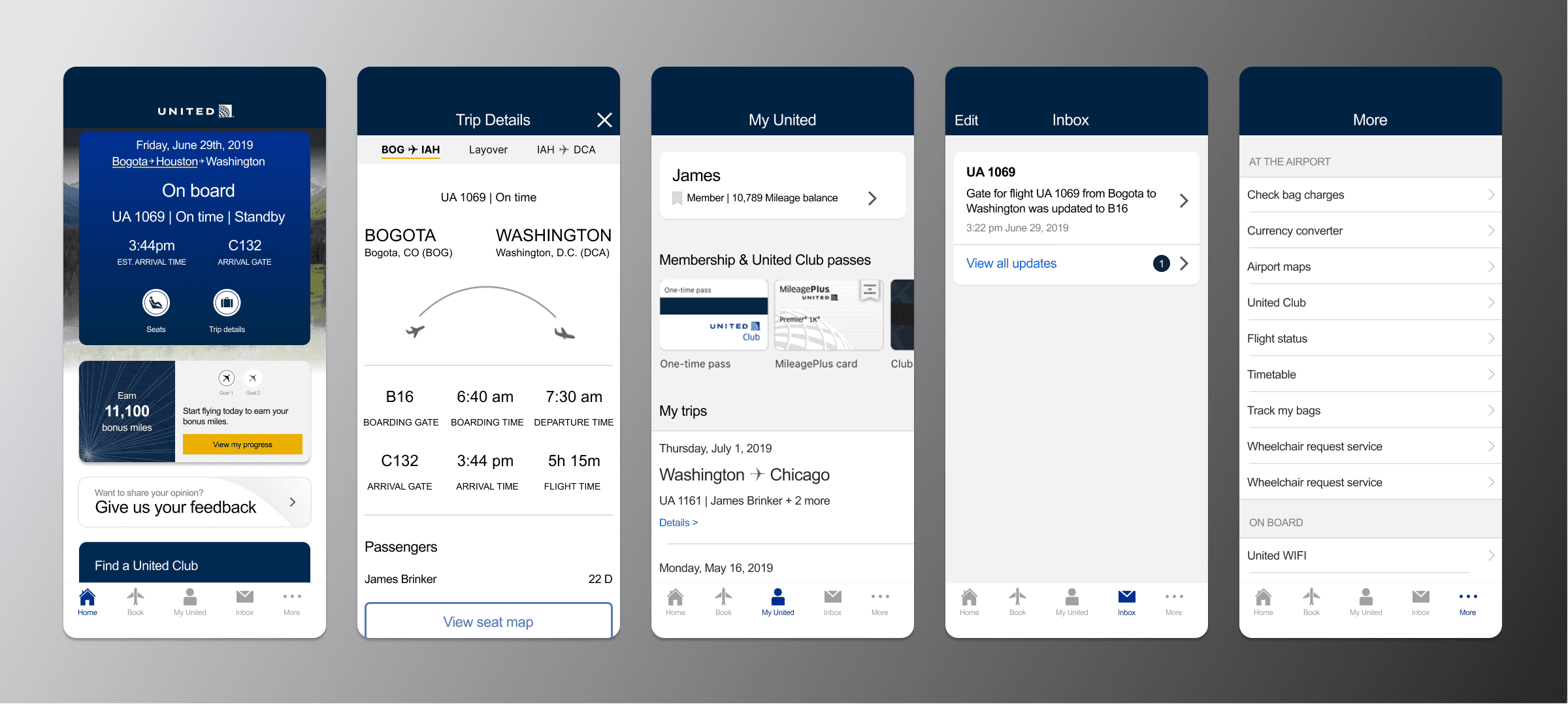
A year of work, 9 designers, one complete app overhaul. Here's what I was directly responsible for.

Dynamic page logic, flows, and ideation

Dynamic page logic, flows, and ideation

Dynamic content strategy across travel moments

Dynamic content strategy across travel moments

Rearchitected app navigation & wayfinding

Rearchitected app navigation & wayfinding

New pages & layers to support dynamic content

New pages & layers to support dynamic content

Due Dilligence

Where it got interesting

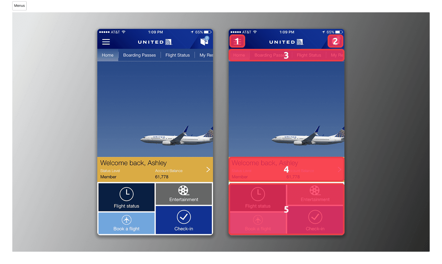
Clarity vs. monetization

Tension

Business wanted front-and-center ad placements on the homescreen and key app pages to push MileagePlus account sign ups.

Decision: Mixed approach

Removed ads and MileagePlus promotions from the home screen during active trips. Consolidated ads into expected locations. Secured executive buy-in first.

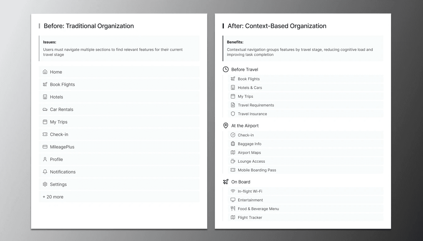
Focus vs. feature visibility

Tension

Engineering and business wanted to add layers of movement to access more content from the homescreen in lieu of traditional navigation.

Decision: Focus

Eliminated multi-directional scrolling and reconsolidated navigation, prioritizing task completion over feature discovery.

Accessibility vs. speed

Tension

Business units prioritized speed to market; legal and brand teams focused on minimum compliance; Design advocated for a broader standard

Decision: Accessibility

Built accessibility into components from the start. Early training on standards eliminated costly remediation.

What I did

My Role

This was the biggest design effort I've led end to end. The scope went from foundational research to shipped product, across a team of 9+ designers, over a year.

  • Lead designer & manager: Set product direction for moment-based travel experiences

  • Framework architect: Created moment-based system adopted across United digital products

  • Cross-functional leadership: Aligned engineering, legal, product through workshops and reviews

  • Hands-on design: Core flows, interaction models, accessibility standards (WCAG 2.1 AA)

  • Team oversight: Managed and reviewed 9+ designers across product areas across 1 year + of work

Design for the most stressed user. Everyone else benefits.